Colombia
Overview
We believe that searching for a good place to eat should be as enjoyable an experience as the moment of savoring the food itself. Columbia was created to simplify the way people discover and book restaurants, connecting them with places that truly fit their style, budget, and mood.
We achieve this through an intuitive and visually elegant app that combines geolocation technology, user-centered design, and a seamless experience. Columbia understands user preferences, shows them relevant options, and allows them to book a table in seconds, without unnecessary steps.
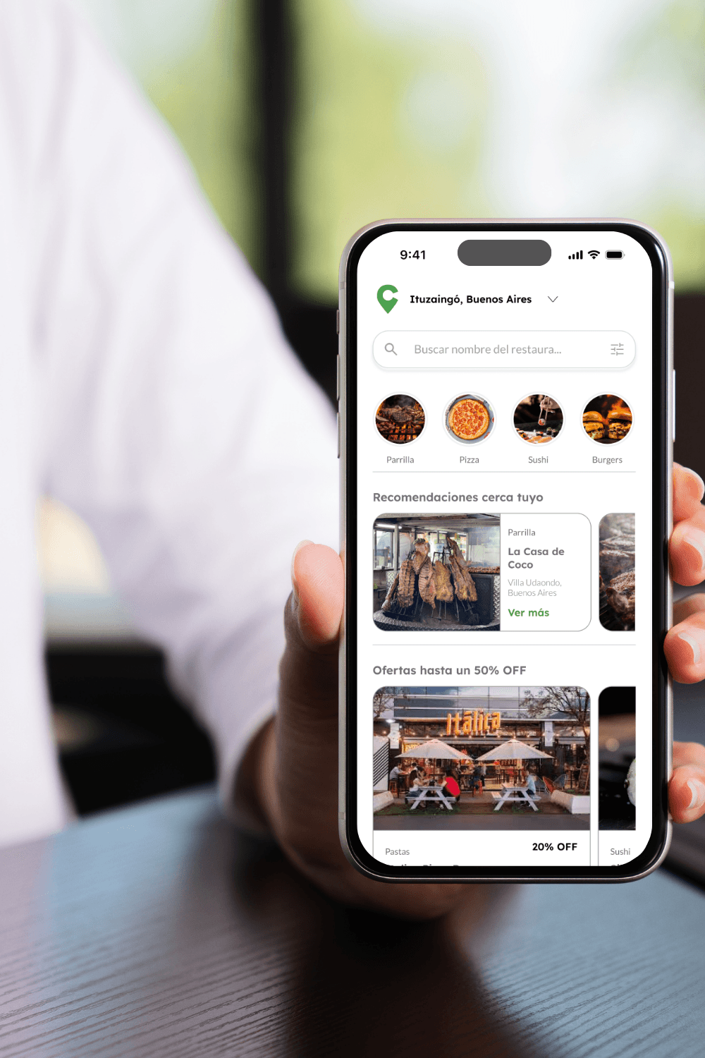
Columbia is a restaurant search and reservation platform, designed to offer a simple and reliable experience.
More than just an app, it is a culinary assistant that transforms the way people search, choose, and enjoy their moments away from home.
Categories
Mobile app
Date
Client
Colombia

Buscá. Elegí. Reservá.
Your new culinary guide, designed to make your life easier and turn every outing into an amazing experience.
Mobile app

Have you ever wanted someone to help you choose the perfect place to go out for a meal?
We believe that searching for a good place to go eat should be just as enjoyable an experience as the moment itself of enjoying the food. Columbia was created to simplify the way people discover and book restaurants, connecting them with places that truly match their style, budget, and mood.
METHODOLOGY
Design Thinking
EMPATHIZE
DEFINE
IDEAR
PROTOTYPE
TESTING
EMPATHIZE
DEFINE
IDEAR
PROTOTYPE
TESTING
EMPATHIZE
DEFINE
IDEAR
PROTOTYPE
TESTING
1. EMPATHIZE

1. EMPATHIZE
About the project
Problem
When people travel or move to a new city, they often struggle to find dining options that fit their needs. There is a lack of centralized and easily accessible information about restaurants, which can lead to indecision and wasted time.
Objective
Create an intuitive web app that allows users to search, discover, and book restaurants in different locations. The platform will centralize relevant information such as menus, hours, reviews, and locations, enhancing the dining experience for users, especially in new cities or unfamiliar environments.
Solution
Solution
Columbia centralizes all the necessary information for users to make informed decisions about where to eat. By offering an optimized user experience through an app, the platform facilitates the real-time search and booking of restaurants, reducing indecision and lost time.

Benchmarking
-
The Fork
Woki
STRENGTHS
Smooth and short navigation: Book in just three steps.
Clear and universal language: Use simple and consistent vocabulary. Well-written error and confirmation messages, with a friendly tone.
Clean and hierarchical design.
Clarity in results: Efficient filters, visual information (photos, ratings, prices) well distributed.
Focus on the restaurant's internal management: Excellent control panel to manage tables, shifts, and reservations.
Allows for easy operation from the premises, even without technological experience.
Adaptable to different sizes of restaurants (from few to many covers).
Functional and direct language.
Functional and accessible design: Meets the basics for operation, with a recognizable structure.
WEAKNESSES
Generic and cold experience: Dependence on discount as a motivator. The focus on promotions detracts from the authentic culinary discovery.
Lack of typical labels or filters of local consumption (e.g., bodegón, parrilla, brunch, wine bar).
Customer loyalty focused on points, not on experience.
The Yums system is functional, but does not create an emotional bond with the user.
Long and confusing navigation for the customer user: Excessive steps and unclear feedback. Unempathetic vocabulary.
Administrative terms affect the fluidity on the user side. Dense design in administrative screens.
Little visual breathing room and too much information simultaneously.
Without incentives or rewards: Does not offer motivations to rebook, nor does it create an emotional connection.
-
The Fork
Woki
STRENGTHS
WEAKNESSES
STRENGTHS
Smooth and short navigation: Book in just three steps.
Clear and universal language: Use simple and consistent vocabulary. Well-written error and confirmation messages, with a friendly tone.
Clean and hierarchical design.
Clarity in results: Efficient filters, visual information (photos, ratings, prices) well distributed.
Focus on the restaurant's internal management: Excellent control panel to manage tables, shifts, and reservations.
Allows for easy operation from the premises, even without technological experience.
Adaptable to different sizes of restaurants (from few to many covers).
Functional and direct language.
Functional and accessible design: Meets the basics for operation, with a recognizable structure.
WEAKNESSES
Generic and cold experience: Dependence on discount as a motivator. The focus on promotions detracts from the authentic culinary discovery.
Lack of typical labels or filters of local consumption (e.g., bodegón, parrilla, brunch, wine bar).
Customer loyalty focused on points, not on experience.
The Yums system is functional, but does not create an emotional bond with the user.
Long and confusing navigation for the customer user: Excessive steps and unclear feedback. Unempathetic vocabulary.
Administrative terms affect the fluidity on the user side. Dense design in administrative screens.
Little visual breathing room and too much information simultaneously.
Without incentives or rewards: Does not offer motivations to rebook, nor does it create an emotional connection.

DEFINE
DEFINE
User Persona
Through interviews, we were able to determine two types of user personas that allowed us to empathize with them and understand our potential users.

Facundo
Medical student
User Type:
He wants dining options
Personal data
Male
Single
25 years
Once, CABA
"I want to take someone to a nice place that isn't expensive and makes me look good... without spending an hour looking for it."
Motivations
Impress your dates with interesting and well-recommended dining options.
Make the most of your free time to explore restaurants without overspending.
Frustrations
Find affordable places with a good atmosphere for a night out.
The lack of centralized information about dining options that fit your budget.
The indecision of not knowing if a place is suitable for a date, especially when you don't have time to research much.
Storyboard

MVP
Search with advanced filters and automatic geolocation to show nearby restaurants.
Detailed Restaurant Profile with key information such as address, menu (with photos), hours, estimated price, and reviews; and the option to save as a favorite.
Quick and Easy Online Booking.
Access to the platform with Google, Facebook, or email quickly.
SEARCH

COMPARISON

FILTERED

INTERACTIVE MAP
HISTORIAL

PERFIL
IDEAR
IDEAR
Usability Testing
These tests were conducted with the aim of evaluating the user experience of the Columbia prototype, analyzing how effective and efficient it is for users when searching for and choosing a restaurant. A representative group of users was engaged, to whom the prototype was presented and specific tasks were assigned. Based on their actions and feedback, conclusions were drawn about the clarity of the flow, ease of use, and overall level of satisfaction during the process.
What worked
All users were able to explore restaurants without needing to register beforehand.
The majority of users quickly understood the search flow and navigation between map and list.
Users were able to easily access key information about each restaurant (price, menu, location, and reviews).
What did NOT work
Some users did not immediately detect the advanced filters to refine the search.
There was indecision when comparing similar restaurants, especially when the prices and ratings were similar.
Some users expressed the need for a clearer visual cue to identify ideal restaurants for dates.
Recommendations
Incorporate greater visual hierarchy in the filters, so that they are more visible during exploration.
Add labels or badges (e.g., “Ideal for appointments”, “Good price-quality ratio”) that help to decide faster.
Include a summary prior to booking, allowing the user to review the selected information before confirming.
To obtain these insights, usability tests were conducted with 5 potential users, selected for their regular use of search applications and digital services. The participants were between 22 and 35 years old, with different profiles, occupations, and eating habits.
Architecture

Userflow

PROTOTYPE
PROTOTYPE
Evolution of wireframes
Welcome
LOW
Hand sketches

LOW/MEDIUM
digitized

MEDIA
Design Patterns

HIGH
Final design

Moodboard
Color VERDE como eje principal:
Confianza, elegancia y conexión con lo natural. Equilibrio entre lo urbano y lo orgánico — el verde representa la calma de una experiencia gastronómica bien elegida, y la frescura con la que Columbia conecta a las personas con lugares únicos.

UI KIT
Typography
Lexend
Lean
Aa
Regular
Aa
Semibold
Aa
Bold
xxlarge - Lexend Bold 56
xlarge - Lexend SemiBold 46
large - Lexend SemiBold 28
medium - Lexend SemiBold 18
small - Lexend SemiBold 16
xsmall - Lexend SemiBold 14
xxsmall - Lexend SemiBold 12
Body large - Lato Regular 16
Body large - Lato Light 16
Body medium - Lato Regular 14
Body medium - Lato Light 14
Cuerpo pequeño - Lato Regular 12
Body small - Lato Light 12
Color palettes
#000000
#FFFFFF
#A0A0A0
#D9D9D9
#4CA04D
Icons

Elements

PROTOTYPE